Showing posts with label editing. Show all posts

Monday, May 12, 2008

Missing Person

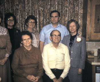
As happens so frequently in old photographs, someone ends up getting something cut off, heads. limbs and legs were all subject to photographic eradication. In this photo a complete person was chopped off from the picture.


I have been working with scanning slides in of the family and noticed the rest of the above missing person in another photograph and decided to return her to the family shot she was cropped out of.


I selected and copied her into the correct spot and then had to blend in her skirt and top. I also copied her arm, flipped it horizontally and inserted it back into the correct position. After a little blending and color corection it was done. We now have a complete family photograph!


Tuesday, April 8, 2008

Colorized Rose

I never know when I start playing with an image exactly where it will end up. At times I have a clear idea of what I want to do and at other times I allow experimentation to lead the way. Experimenting gave me the results on this image.


I first used the darken/lighten Nik filter to deepen the shadows in the background. I then applied the brilliance/warmth filter to increase the detail on the rose. I applied the old photo filter and reduced the opacity of the layer to 67 percent allowing the color below to peak through. This gave the effect of an old colorized photo. The last step was to apply the polaroid transfer filter to rough up the edges.

Sunday, April 6, 2008

Roses

Spring is here in the south and my rose bushes are well on their way to supplying me with batches of beautiful blooms once again. This is one of last years blossoms gussied up.


I used the Nik Efex foilage filter and then the polaroid filter.

Monday, March 31, 2008

Modifying Art

A friend asked me if I could help her with a piece of artwork for her genealogy research. She wanted to do some digital copies for her family reunion. She found a ship picture that she liked that was a became a bit grainy when the size was increased.


I increased the size to fit on an 8.5 x 11 cover sheet. I made a copy of the file in photoshop and then ran the rough pastel filter on it. This pretty much destroys all of the details. I next took the original image, placed it over the rough pastel image and reduced the opacity to 58%. This helps bring back the detail of the people on the boat and still allows the artistic image to show through. I do this trick with portraits that I want to apply an artistic filter to and still maintain detail. I added a contrasting color for the background and text for the cover page.


Sunday, March 30, 2008

Composite Photography

Photography shops love to sell parents and grandparents combined photographs. This was very popular while I was growing up and very easy to achieve with a little effort. I took the following 4 photgraphs and combined them in a classic style.


After selecting the portions of the images I wanted and copy and pasting them into a new file I began playing with the composition. I increased the size of some and decreased others. After getting the arangement I found pleasing I used the high key filter and then selectively applied the vignette blur, painting it in around each headshot. I finally used the vignette blur, placing the center on the largest picture and allowing the remainder of shots to be slightly blurred.


Friday, March 28, 2008

Sun Glasses

In one of my many photoshop books it explained how to make a high contrast black and white photo. This is one of my favorites and sits on my desk at work. I started with this photo taken on vacation.

I cropped it from horizontal to vertical and zoomed in on his face. I removed all of the background noise and substituted a black background. Working in layers, I switched the mode to black and white and increased the contrast on one layer decreased it on another. After erasing from one layer to show the one underneath I ended up with this photo.


Tuesday, March 25, 2008

50th Anniversary

Mom and Dad celebrated their 50th anniversary in 2006. I took this last photo of them together and it desperately needed help.

My camera settings were way off, mom and dad were too far apart because of his wheelchair and I wanted to be able to flatter them both with this photo. After adjusting the color and contrast I removed mom from where she was sitting and moved her over closer to dad. At the time I did not have the Nik Efexs filters so I softened her face by copying into another layer her entire face, adding gausian blur and reducing the opacity. I removed marks from where dad had bumped his head and softened him a bit too. With them cuddled up closer together I was able to crop the photo into a vertical instead of horizontal. The wallpaper in the background was darkened and blurred to help it become less distracting. The background behind mom needed to be repaiered and blended once she was moved.


Pop Art

Once I purchased my own photo printer things got interesting. I created a dozen different 8 x 10 pop art prints of family members for a graduates new apartment. I started with just a few and then the request came in so that she could fill a wall. One of my favorites was taken from this photo taken on a trip to the zoo.


I removed the background and used the Photoshop posterize filter. From a copy of the original I used the find edges filter and dropped it in on the top to give the image a bit of definition. I created a "mod" background and dropped it in behind.


I framed all of the photos in 8 x 10 plain black metal frames.

Monday, March 24, 2008

Beach Wedding

When you have a wedding at the beach the world tends to get invited to share it all. Three years ago this couple tied the knot in front of large crashing waves. I had a viewpoint from the roadside above them. All of their photographers were on the beach level below me, so I took some shots that I am pretty sure they didn't have the vantage point to get. This shot was directly after the wedding, the young couple embraced, they had made it through it all and were husband and wife.


The photo begged to be made into an oval, which I did with softened edges. The Nik darken/lighten center filter helped finish off the effect.

Sunday, March 23, 2008

All Sunny

You can get some great casual shots with babies if you are just willing to sit and wait. Her uncle kept putting her in a sun beam and her great-grandmother kept telling him to move her. Although I know it was tough for her to see, I liked the effect it was giving her against her uncles dark shirt. I waited for him to wiggle her back into the sun and her to concentrate on the book and snapped.

As much as I liked the resulting photo I wanted to enhance the color of her skin and increase the drama against his dark shirt. The low key filter helped bring out the color in her skin. I then applied the darken/lighten filter to fade his dark shirt into the background. I next applied the vignette blur, making sure that the center point was on her nose.

Another one for her baby book.

Saturday, March 22, 2008

Cropped Creation

When I first snapped this photo I knew it was a disaster. One person leaning backward and too close, the other listing in the opposite direction. Although when I studied the photo I noticed that there still was something there to save.

I cropped the photo down to one person. I removed the shine from her face, added a skin softener and glamour glow and darkened the edges. Keeping her face sharp and bluring the background edges draws the eyes to the center of the photo and her pretty face. Just for fun I added an artistic filter to give the image a painterly quality.


From disaster to delightful! Happy Easter!

Friday, March 21, 2008

Busy to Beautiful

Sometimes you have to look closely at an image to see the hidden image within. I have wanted a professional photo of this little angel for some time and decided to create one myself. After digging through photos that I had taken over various visits I settled on this one taken this past Christmas.


She was studying her great-grandmother's face intently. I started by removing the background noise and softening the edges so that she didn't look like she had been cut out. The glamour glow filter enhanced her coloring and the high key filter dropped out some of the color. Soft focus enhanced the sweetness of her face. I added a very soft pink to the background to keep it from contrasting to starkly and then used a vignette blur.


I did not have to enhance the color of her clear blue eyes, that color came directly from her grandfather. Placed in simple silver frames, the resulting image will make a nice Easter gift to both her mother and her great-grandmother.